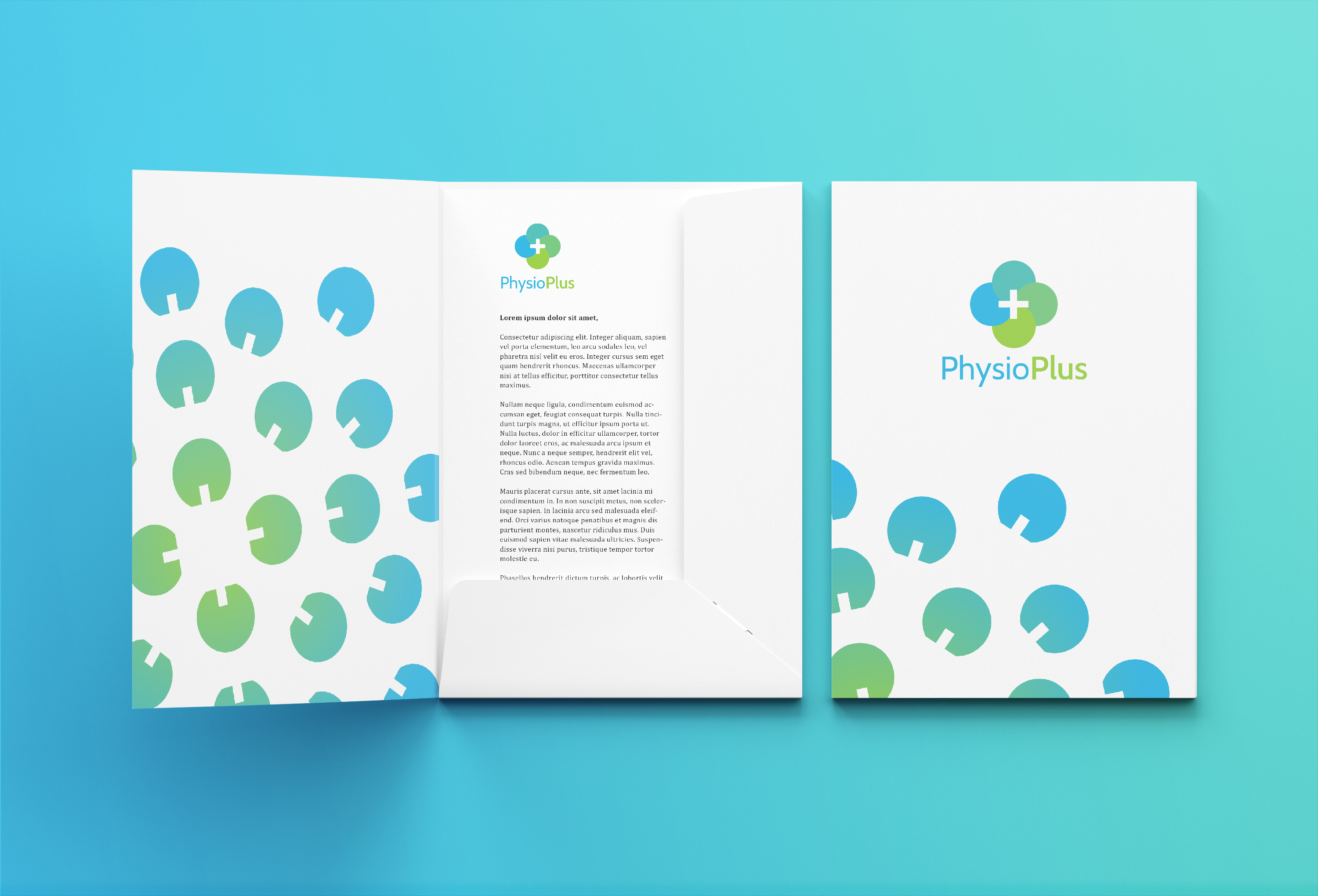
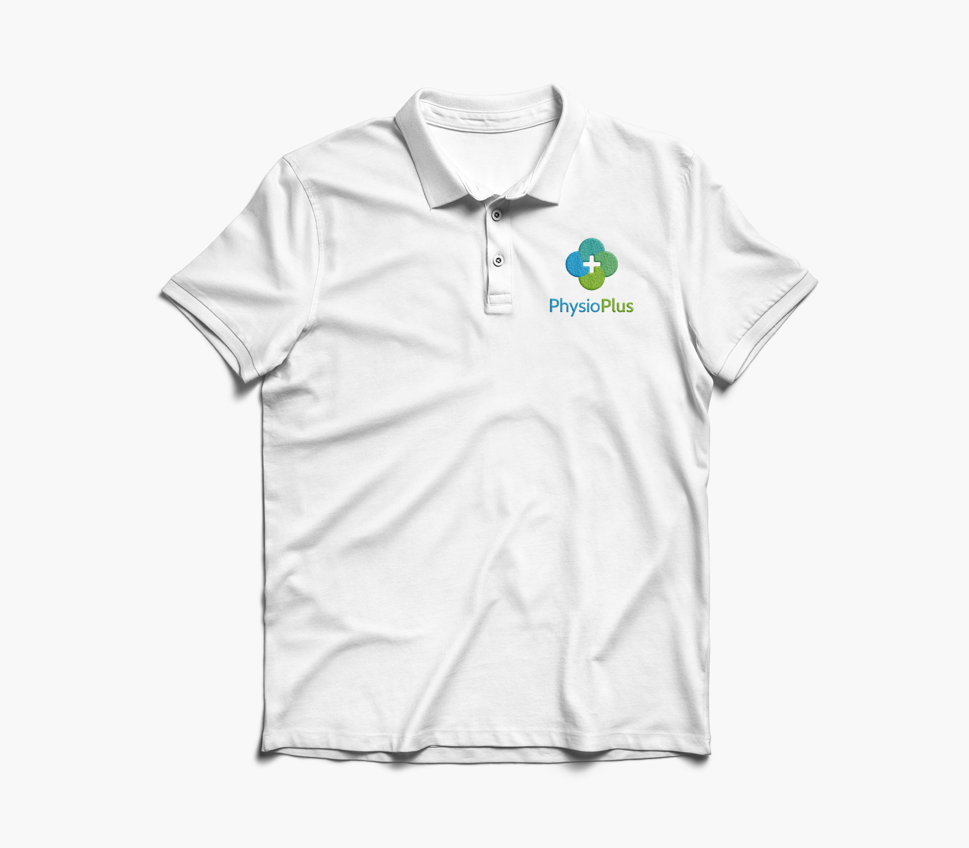
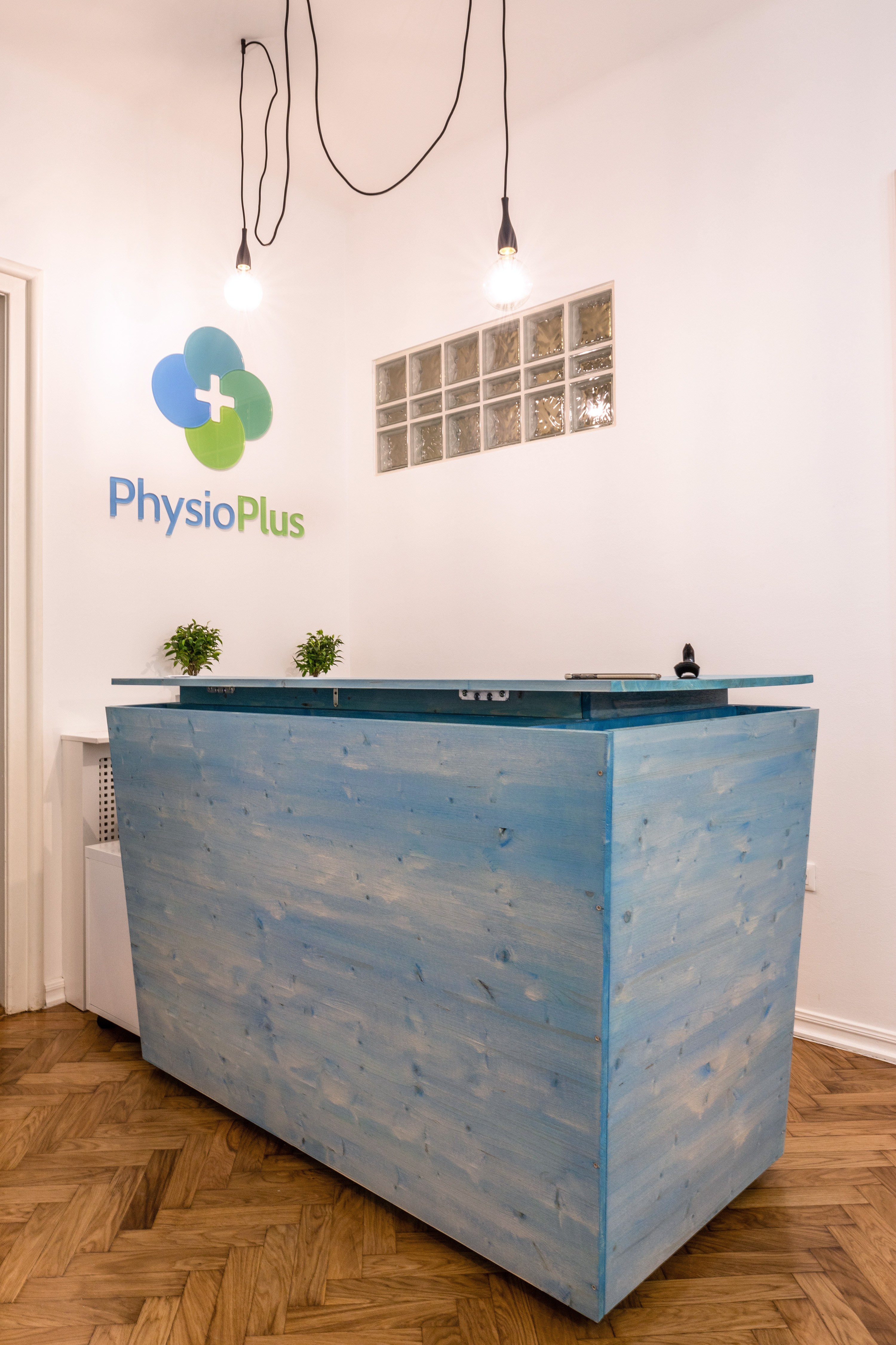
PhysioPlus is a medical centre for physiotherapy run by two accomplished physiotherapists — Tomislav and David, who have made their name in treating professional athletes, including Olympians. Plac Studio got an offer for an entire branding and after an extensive research we proposed the name — PhysioPlus. The visual identity of PhysioPlus consists of four overlapping circles and the plus sign in the middle, thus making a simplified illustration of the spinal vertebra. By rotating and multiplying those elements, a flower appears, symbolizing the natural world and healthy lifestyle. The modular desing of the sign permits multiple applications. The colours, various shades of green and blue, suggest a serene and peaceful recovery that PhysioPlus provides for their clients. Visual identity is applied to the variety of materials — from signage to online content for the Center.

